PARENT DESIGNED.
AMERICAN MADE.
WE HELPED MAKE A SMALL BRAND BIGGER.
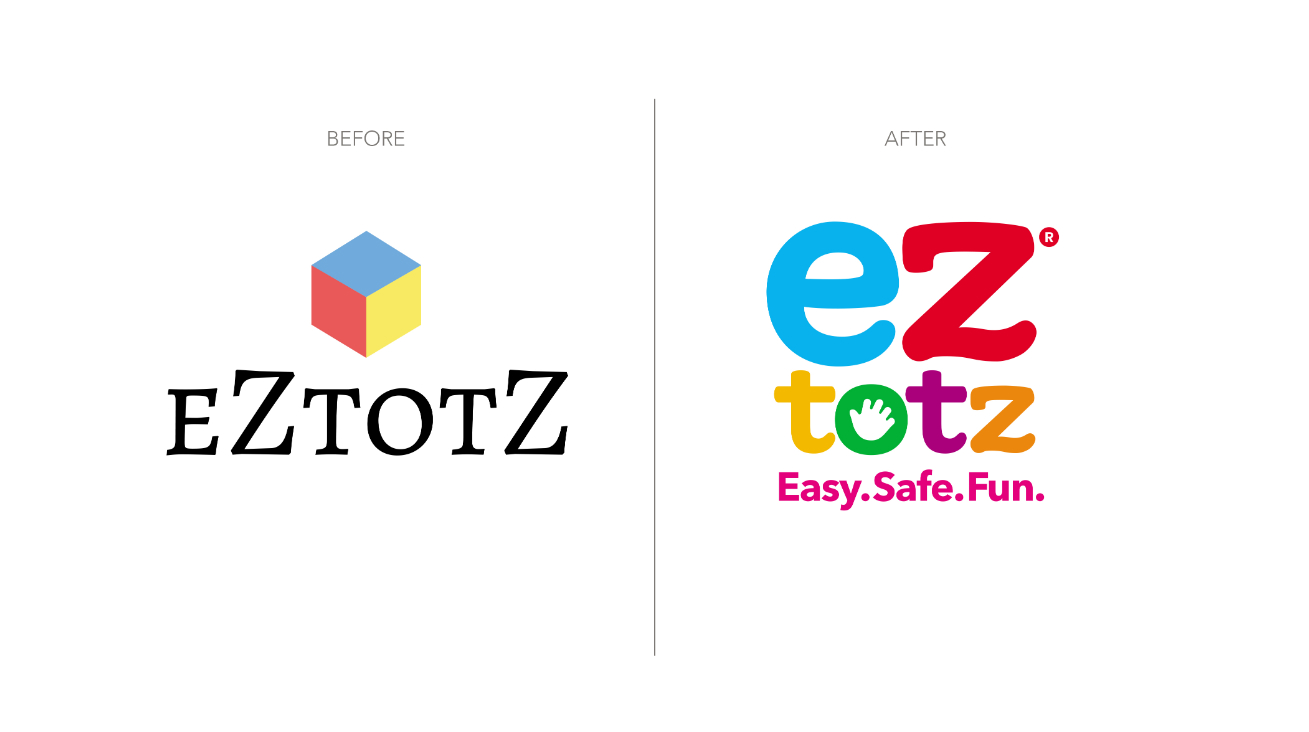
eZtotZ like other scrappy start-ups, was established to address a known problem through innovative solutions. Specifically, they aimed to provide families with hassle-free and user-friendly products to support the growth and development of infants. But here’s the twist: their brand didn’t quite shout out this dedication or show off how awesome their stuff is.
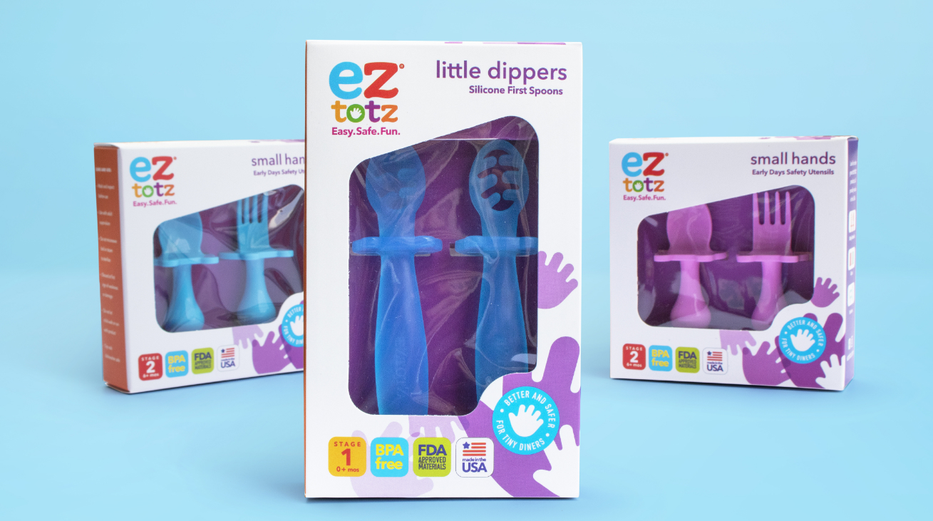
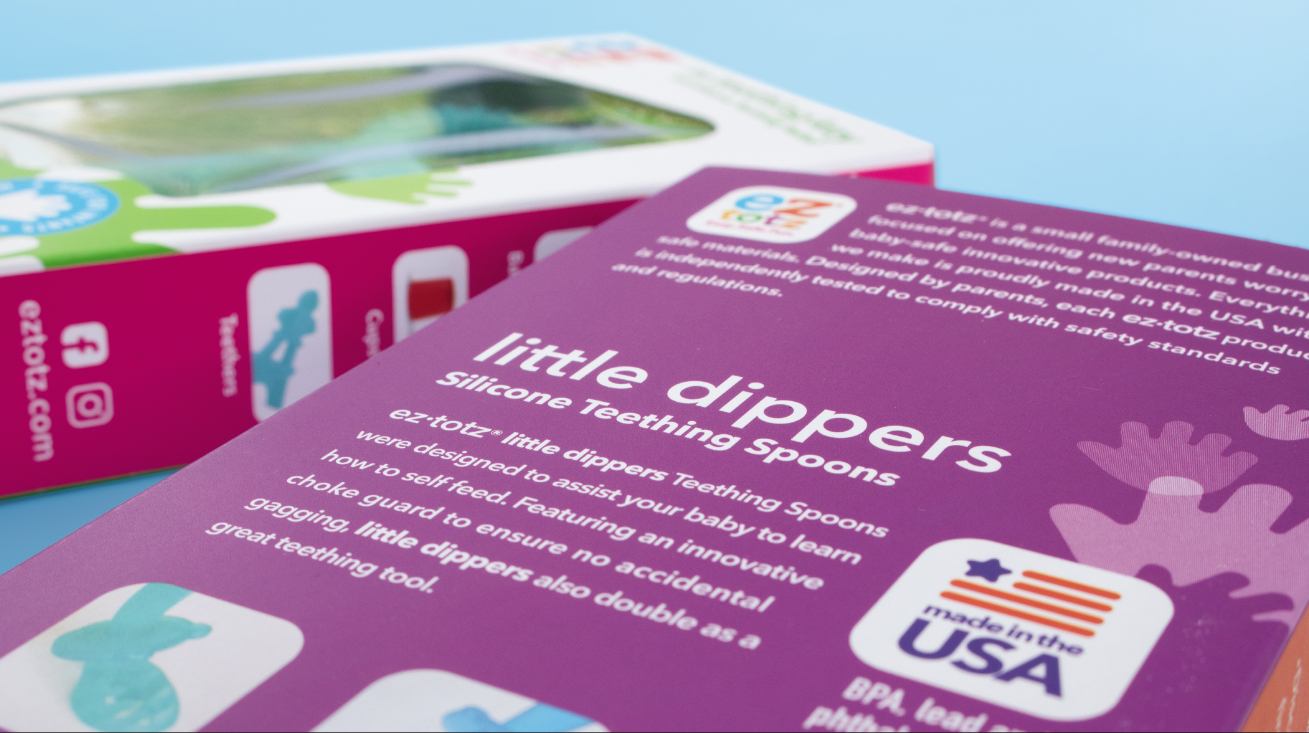
To rectify this, eZtotZ sought the expertise of Fisher Design to revamp its brand identity and packaging design. Our approach involved creating a modern and minimalist aesthetic, characterized by vibrant colors and straightforward messaging that perfectly matched the high-quality nature of their American-made products.
OUR ROLE
01 | RESEARCH & AUDIT
02 | PRODUCT ARCHITECTURE
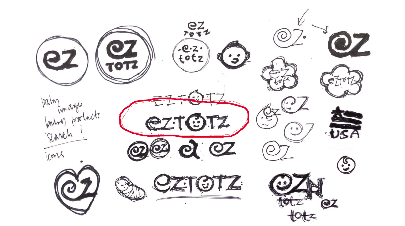
03 | LOGO DESIGN
04 | MESSAGING
05 | ICONOGRAPHY
06 | PACKAGE DESIGN
07 | ILLUSTRATION
08 | STRUCTURE DESIGN
09 | PRODUCTION ART


